WomanUP
WomanUP was created by Dr. Leigha Saunders, a Naturopathic Doctor (and former owner) at True Roots Healthcare.
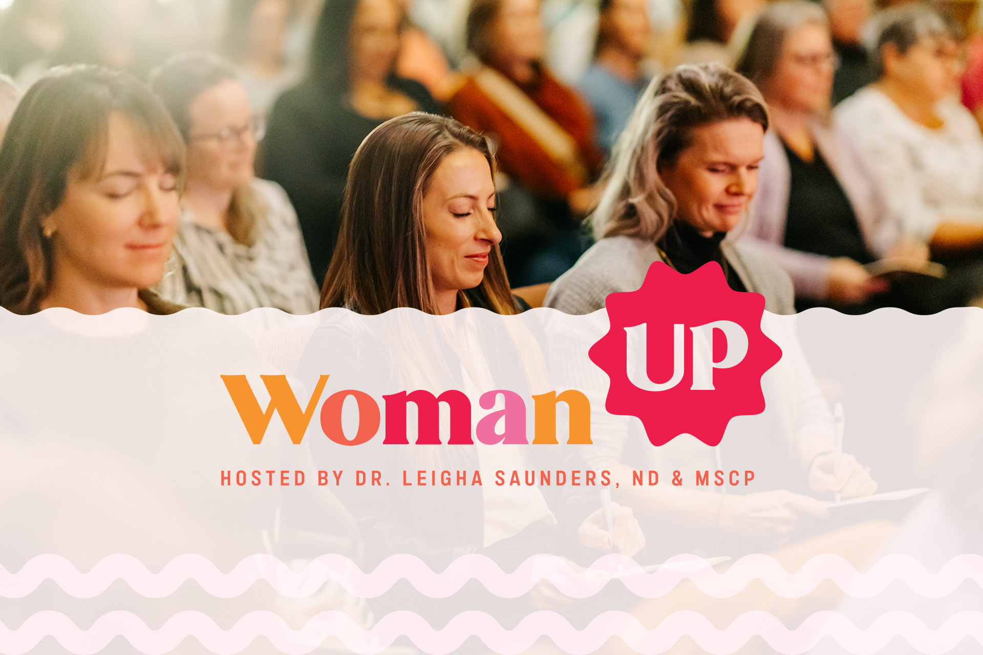
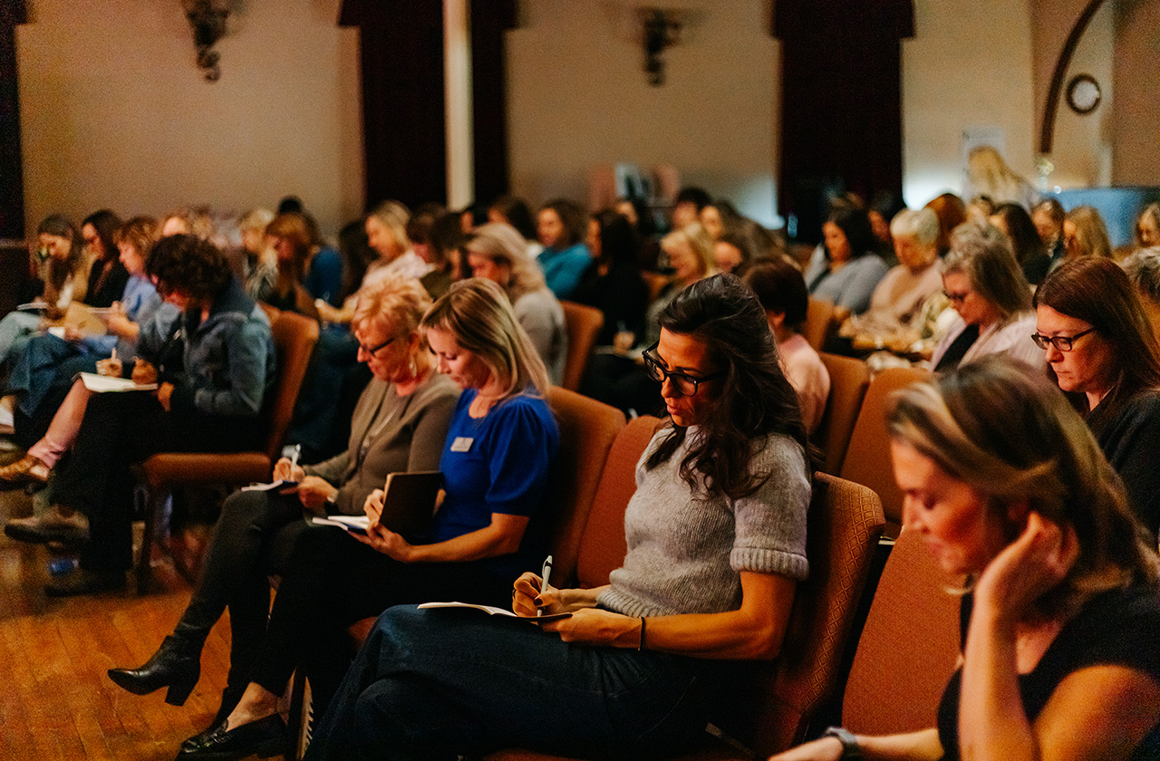
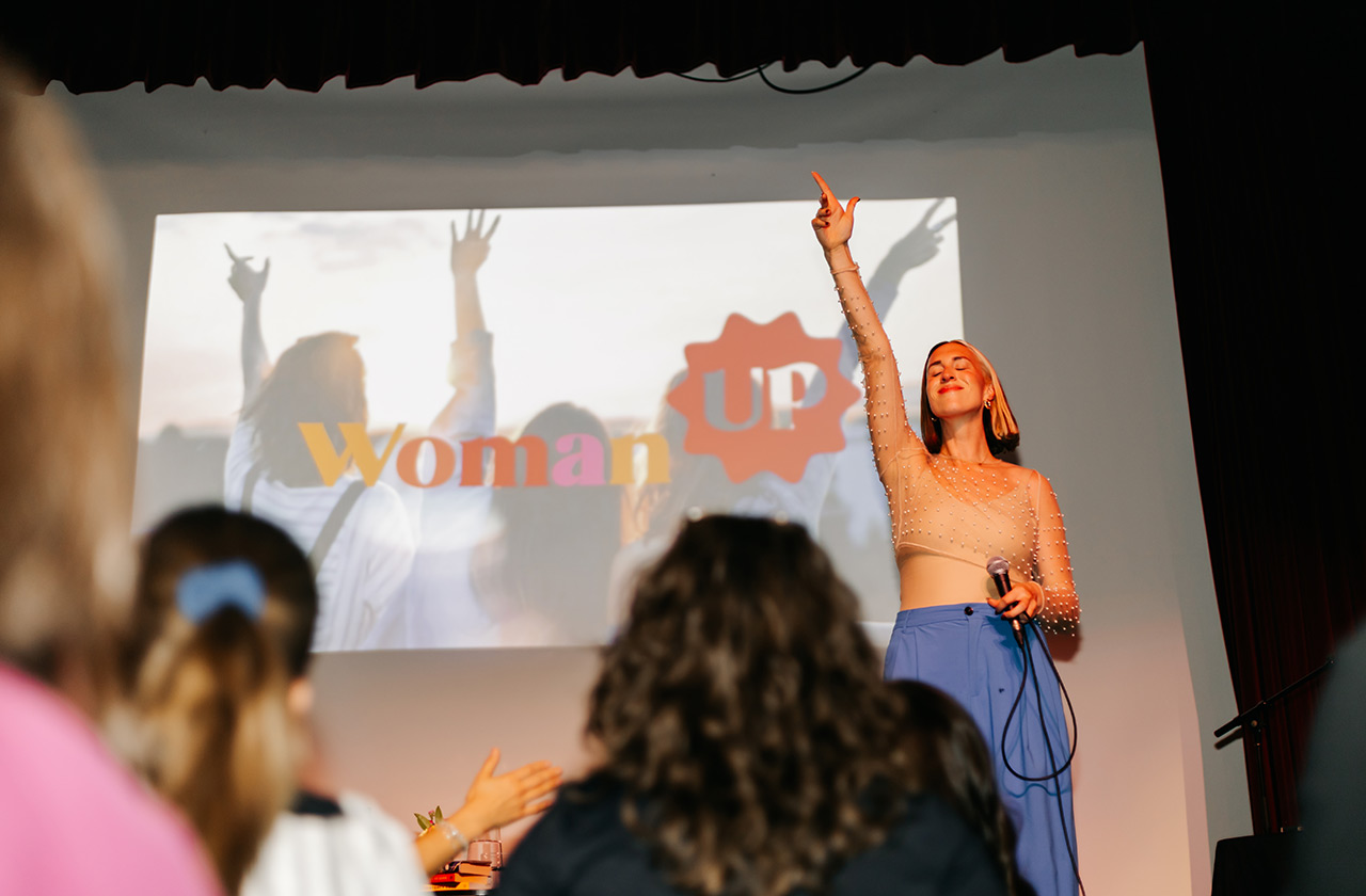
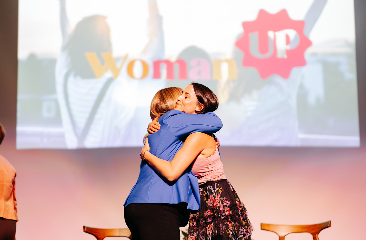
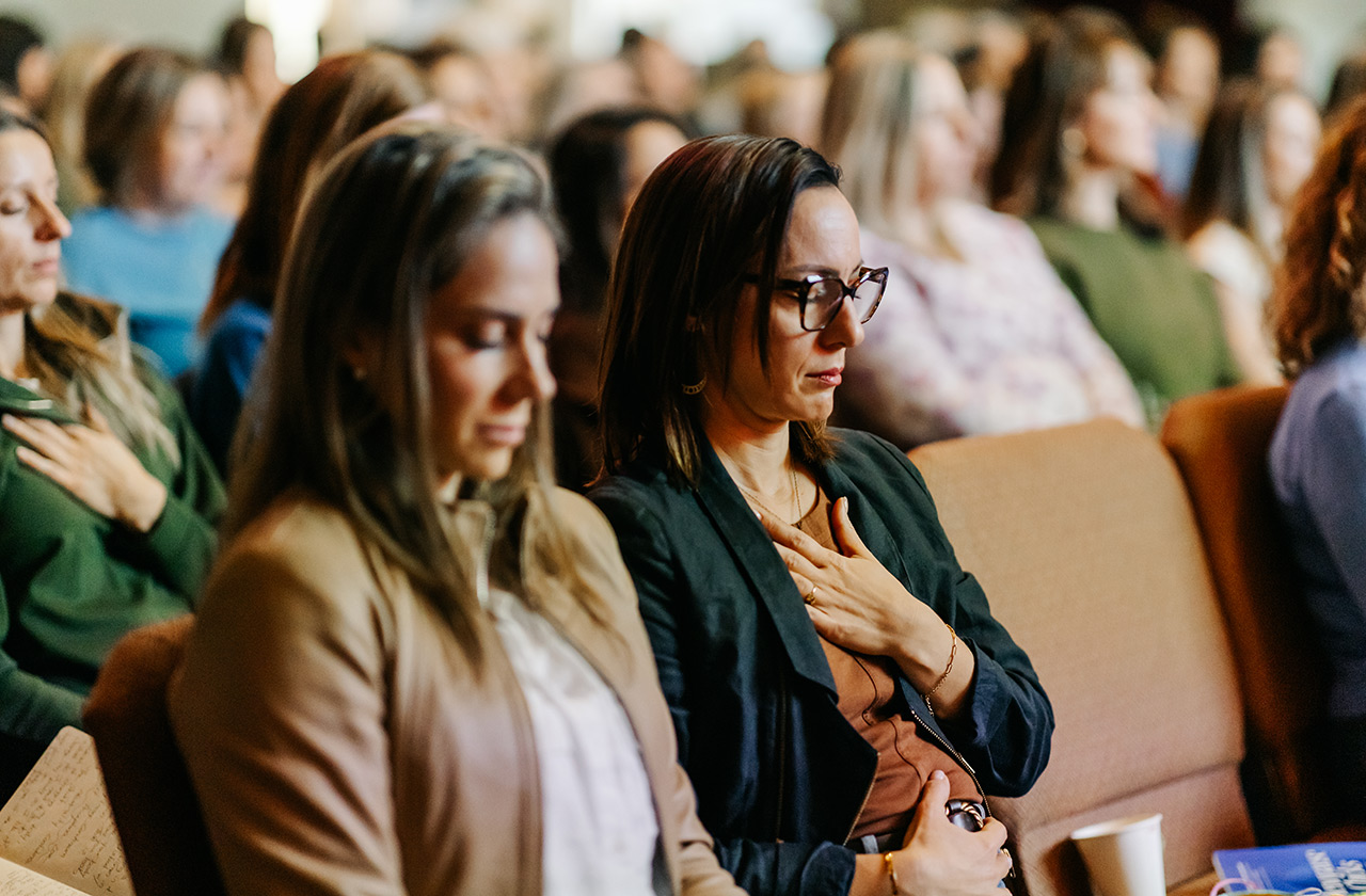
Her mission was to host a powerful one-day event for local women to connect, be inspired, and learn from expert speakers about levelling up their health and wellbeing. Having attended ourselves, we can confidently say the event exceeded expectations – an uplifting and motivating experience from start to finish.
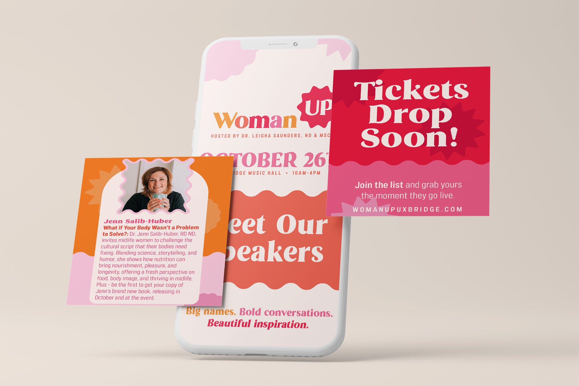
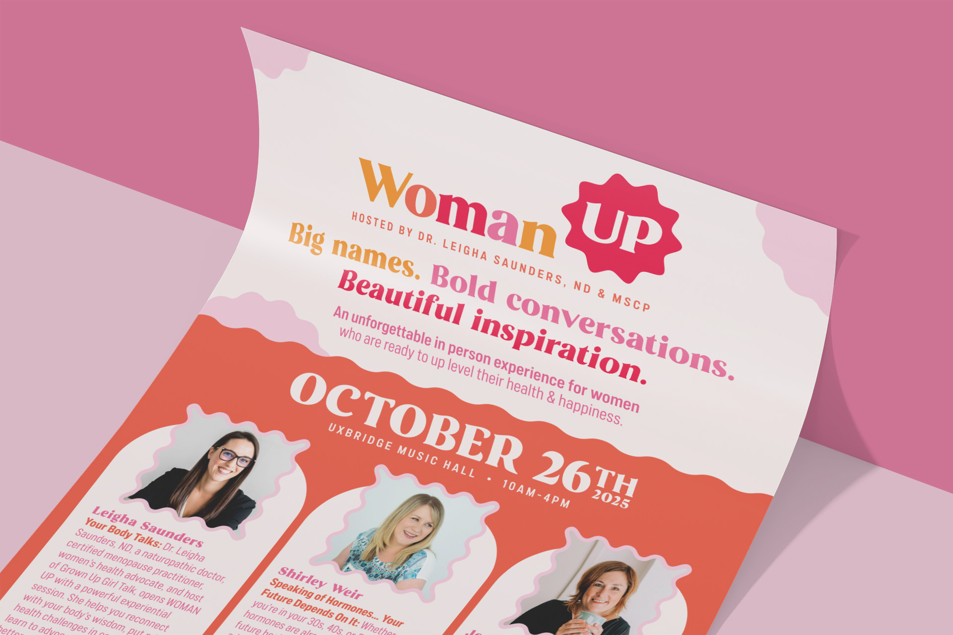
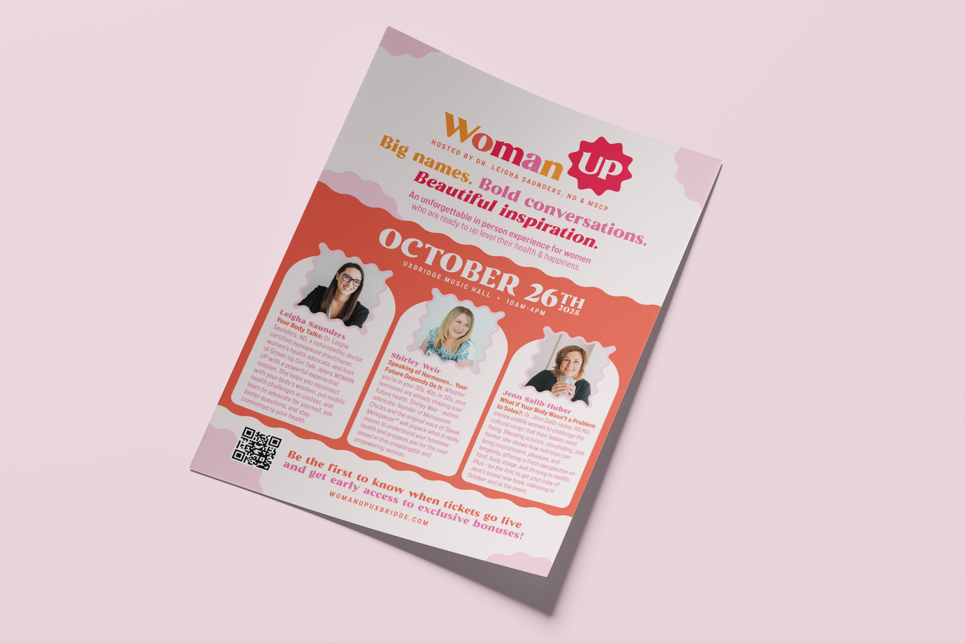
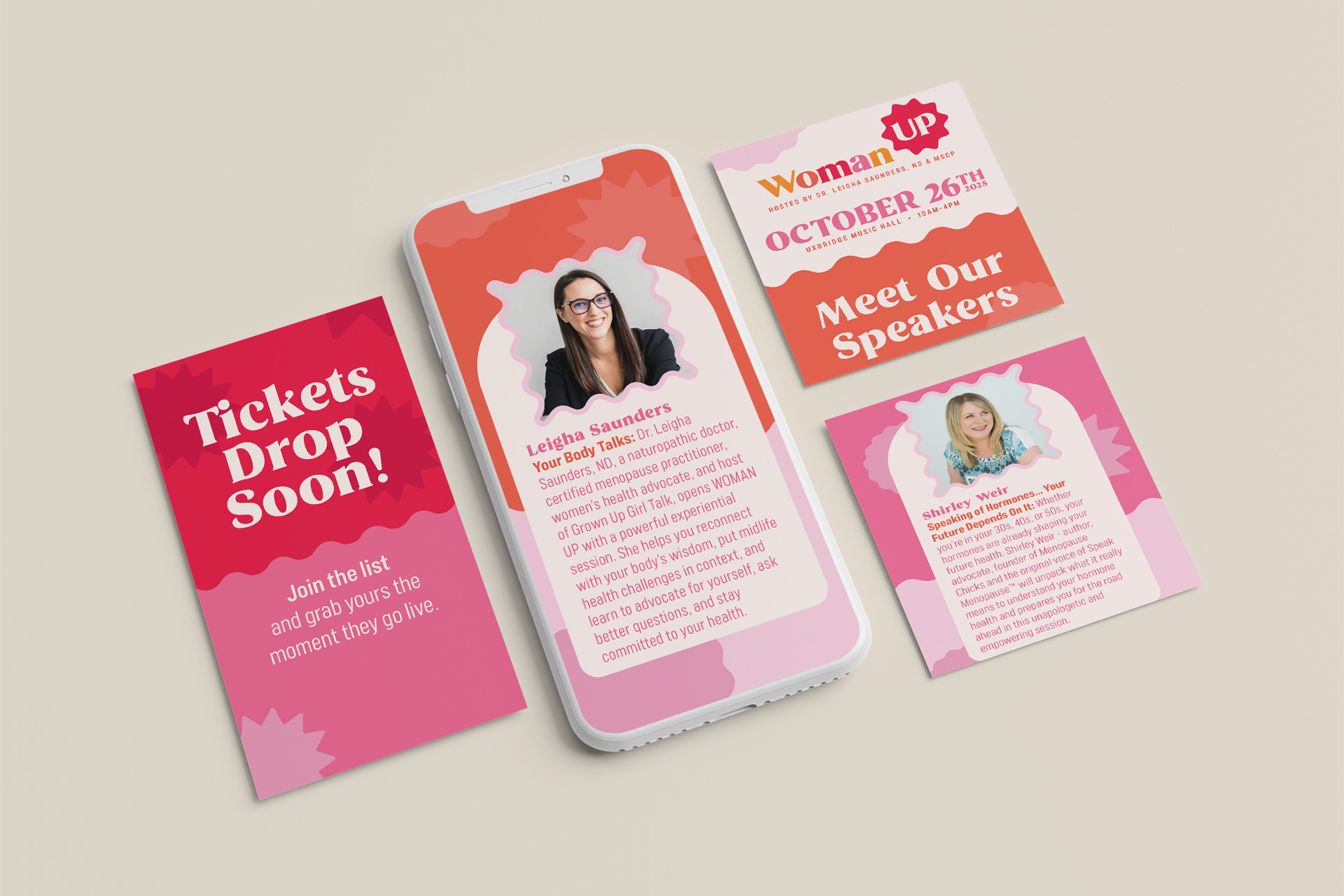
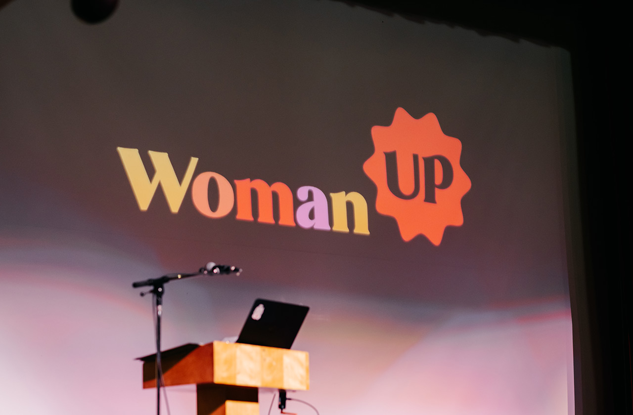
We were thrilled to be a design sponsor for the event and had a blast creating the marketing materials. Our work included the WomanUP logo, posters, signage, social graphics, and more. The bright, cheerful colour palette gave us plenty of room to get creative, and we added playful personality to the brand by pairing the logo with squiggly lines and lively shapes. The result is an inviting and energetic look that truly brings the brand to life.
To learn more about WomanUP visit womanupuxbridge.com
Our Process
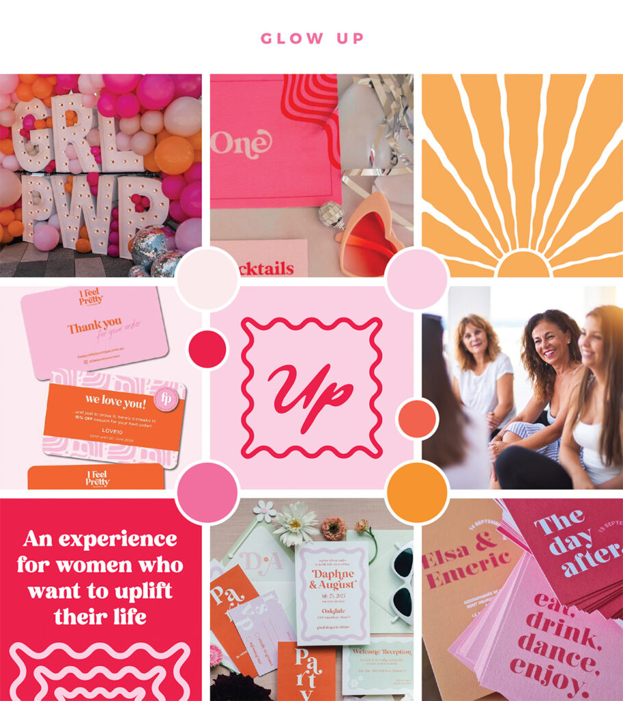
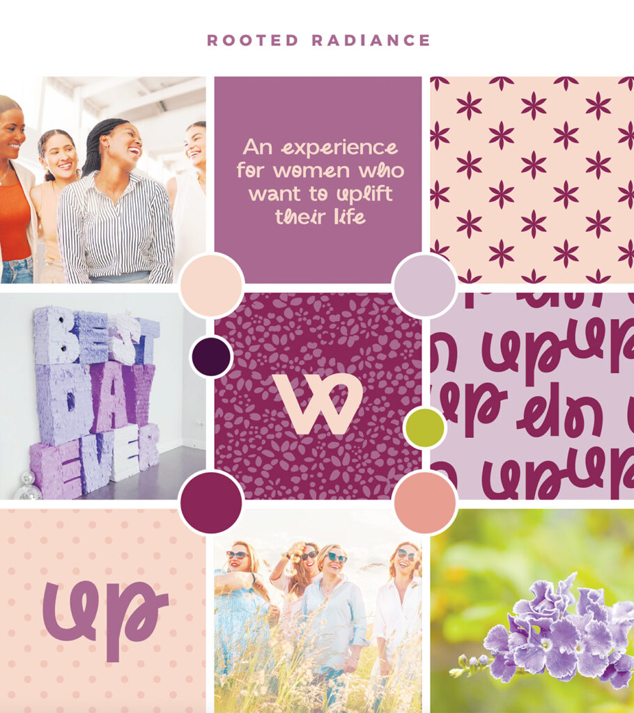
Mood Board
We start every logo project with a mood board to capture the feeling a brand wants to convey. This gives us a visual foundation and helps confirm the creative direction before we move into design. Each mood board brings together curated images, colours, typography, textures, patterns, and tone-setting keywords. It ensures our team and the client are aligned from the start, and spending a bit more time here often speeds up later revisions by making key style decisions early on.
Logo Concept
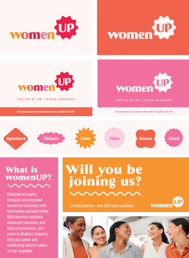
After the client reviews the mood boards, they select their favourite, and we carry that direction into the concept phase. Typically, we present two to three logo concepts. In WomanUP’s case, we were so confident in the first concept that we sent it on its own for feedback. Dr. Leigha was immediately on board and approved it with just a few small adjustments – capitalizing the “w,” shifting “Women” to “Woman,” and adding a tagline.
Final Files
Once the logo is approved, we package up the final files in a range of formats, including vector files (.ai, .pdf, .eps) along with high-resolution JPG and PNG versions. In addition to the full-colour logo, we include a variety of alternate formats such as black and white, single-colour, and coloured-background variations to ensure the brand is ready for any application.
Branded Elements
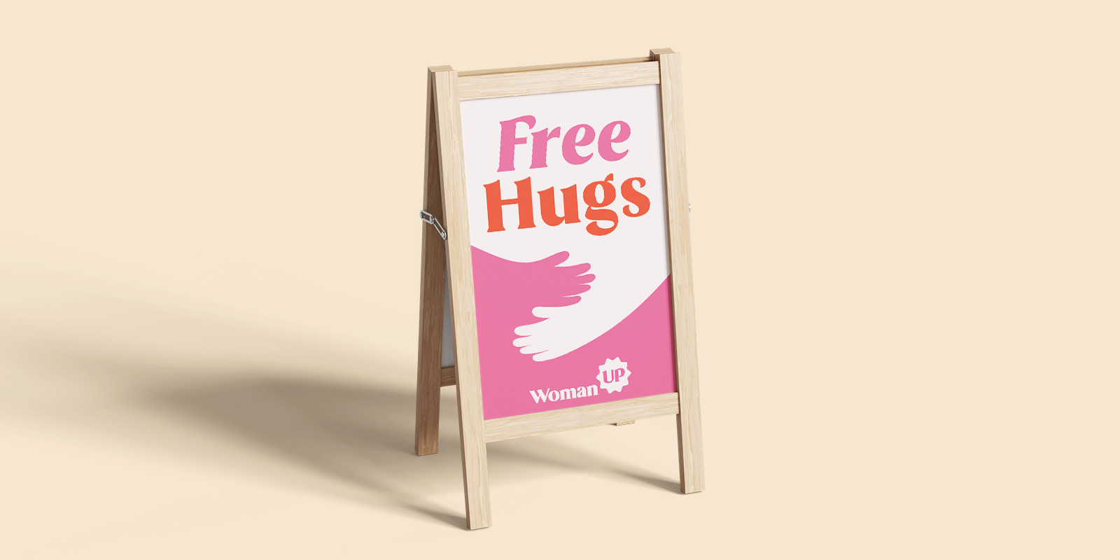
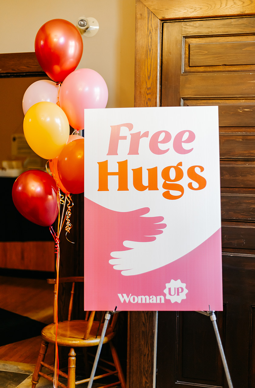
Beyond the logo itself, many clients choose to extend their visual identity with additional branded elements or a full brand guide. These pieces help bring the logo to life across real-world applications. For WomanUP, this included social graphics, a poster, a slideshow, and even a “Free Hugs” sign for the event. While a logo is the cornerstone of a brand, it doesn’t exist on its own. Supporting assets create consistency, build recognition, and help the brand show up confidently wherever it’s used.