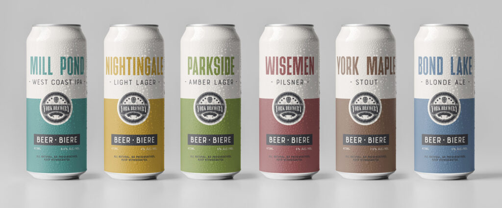
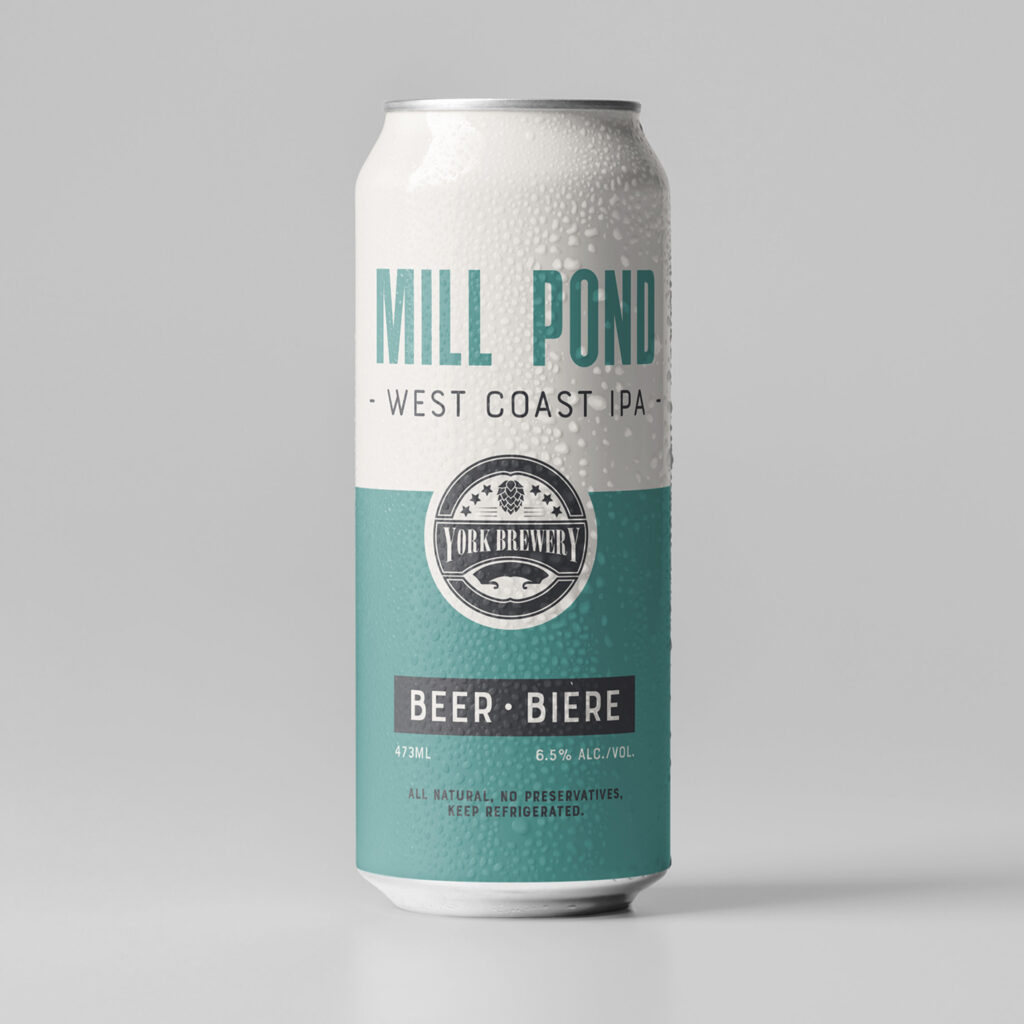
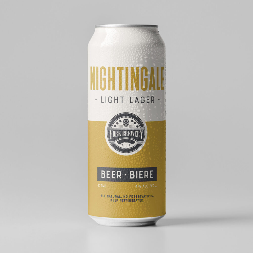
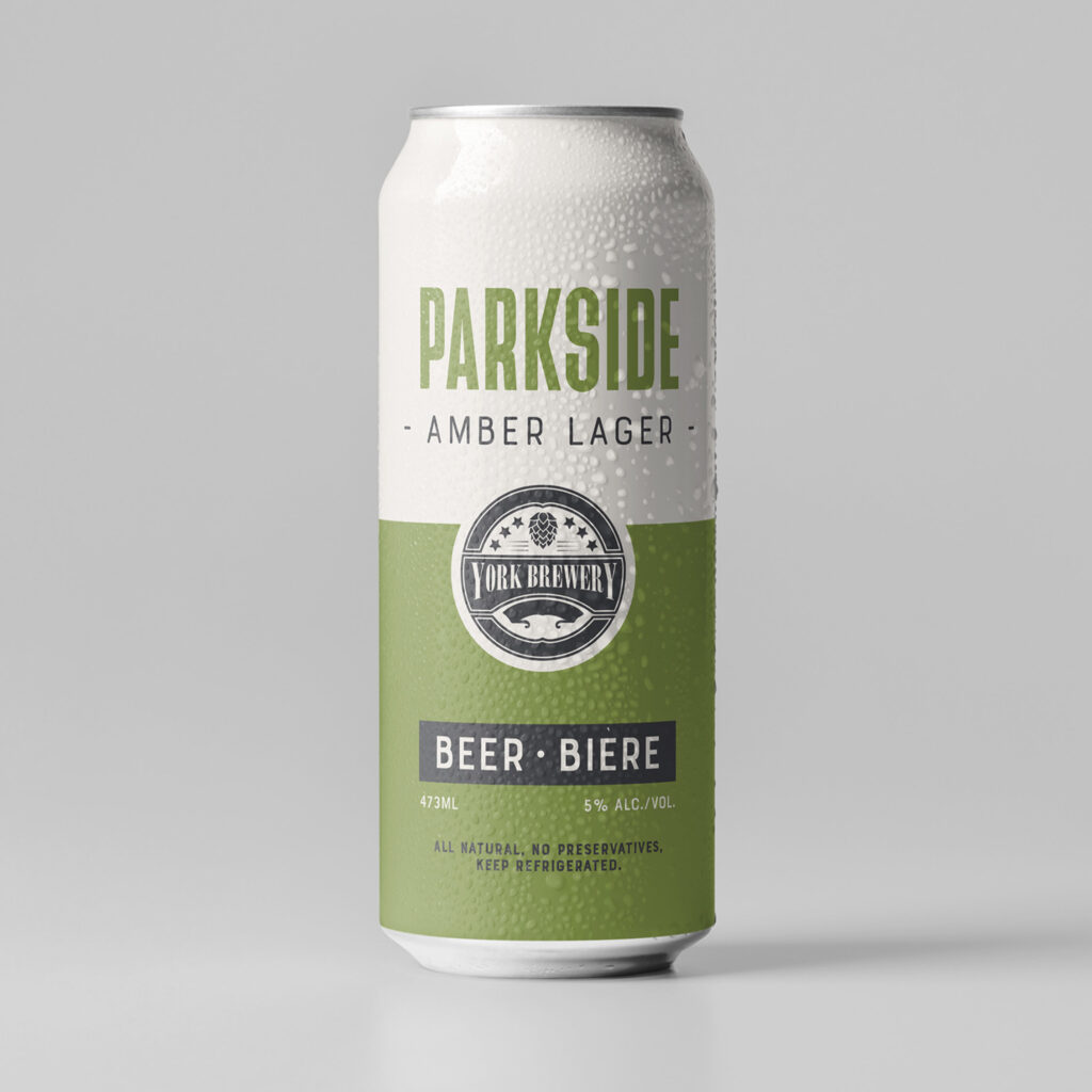
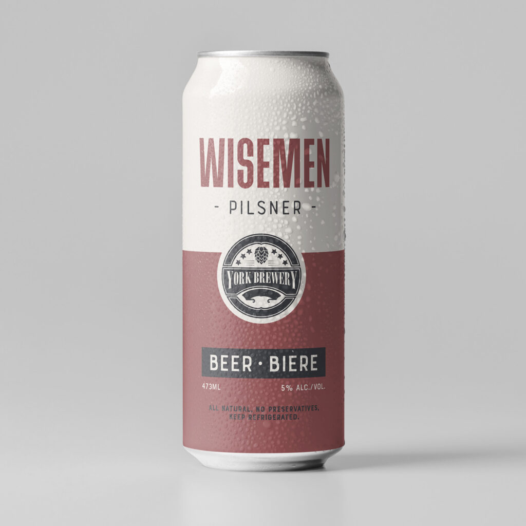
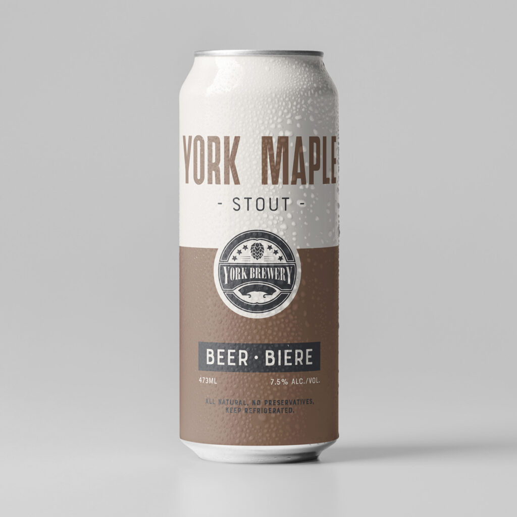
York Brewery Beer Labels

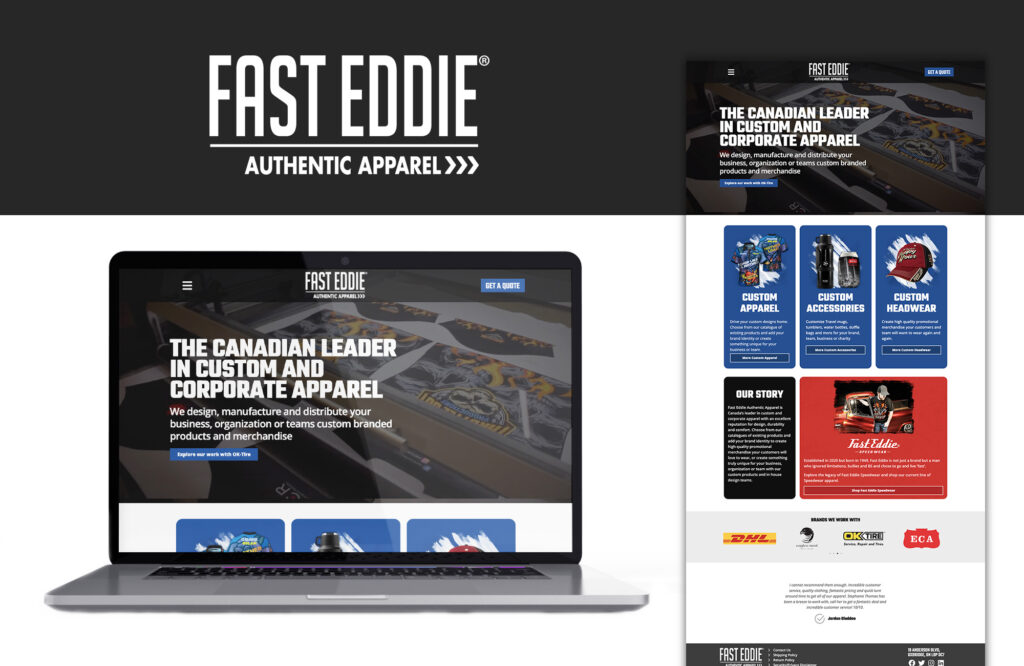
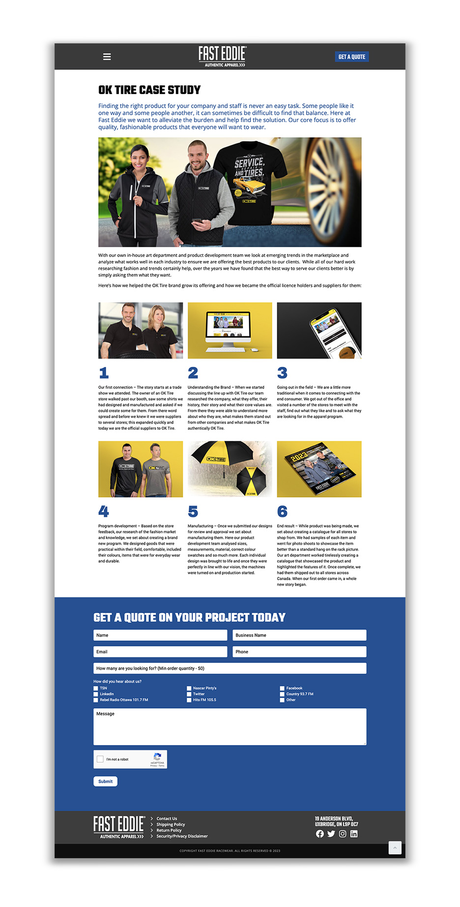
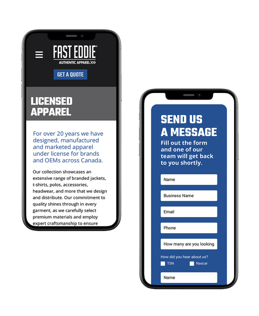
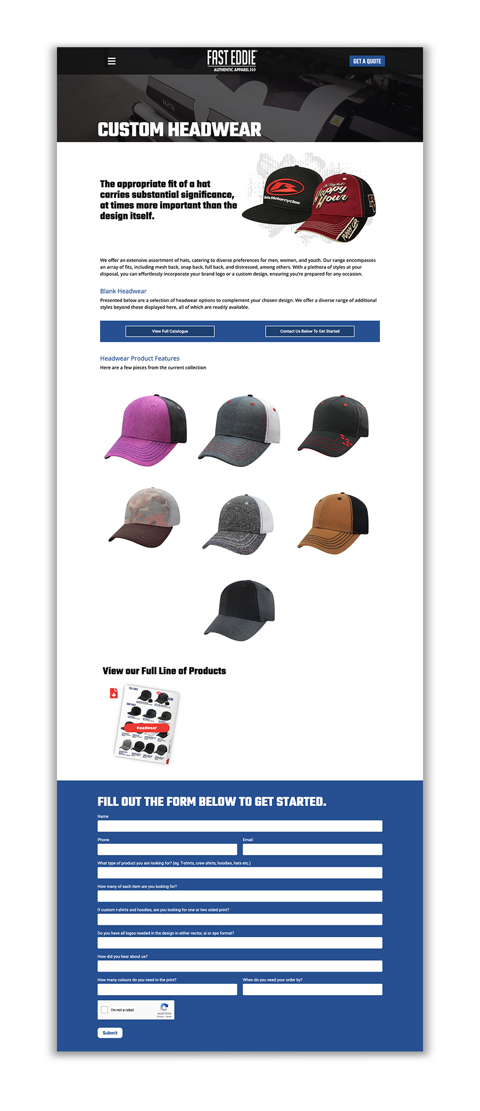
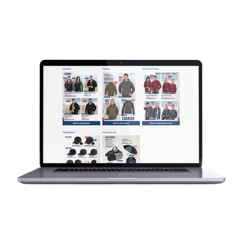
Fast Eddie Authentic Apparel

You Are Here – CBC Radio Interview

On Sunday, September 24th, Caitlin was interviewed on the CBC Radio show Fresh Air with Ismaila Alfa.
Continue readingFrom Print to Pixels
Why Advertisers Should Embrace Facebook Ads After Metroland Shuts Down Newspapers
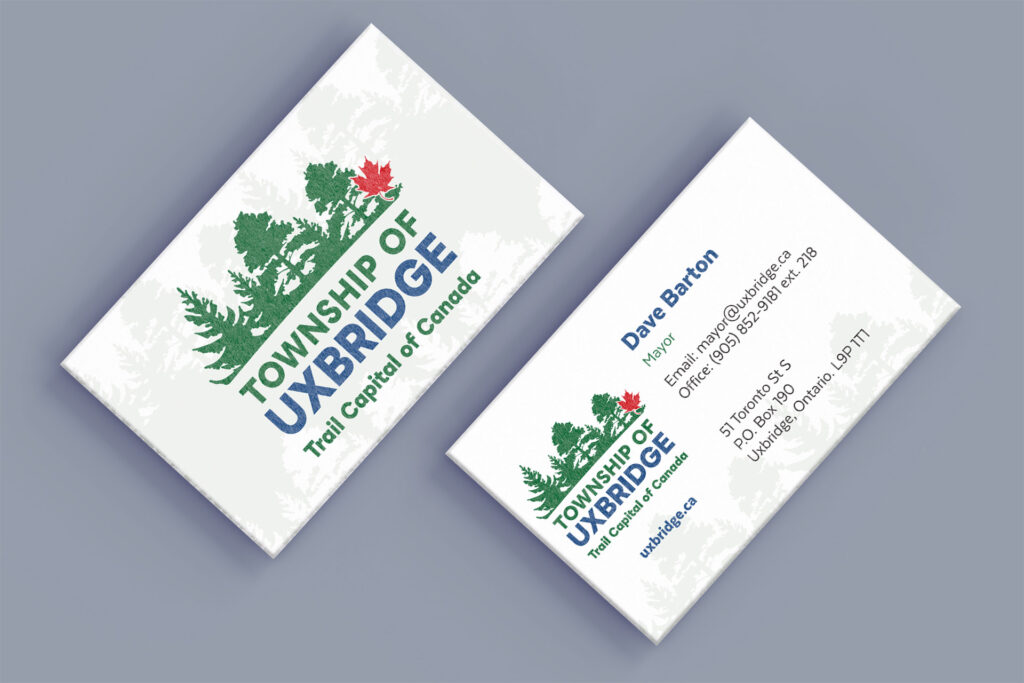
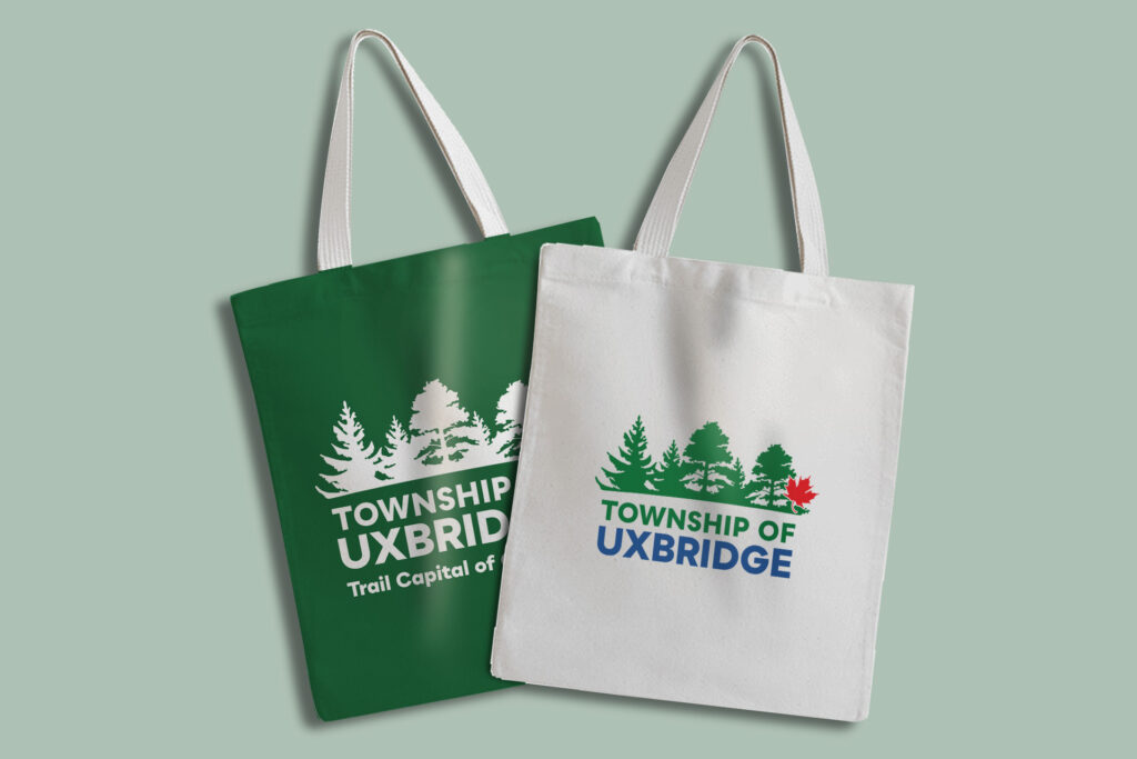
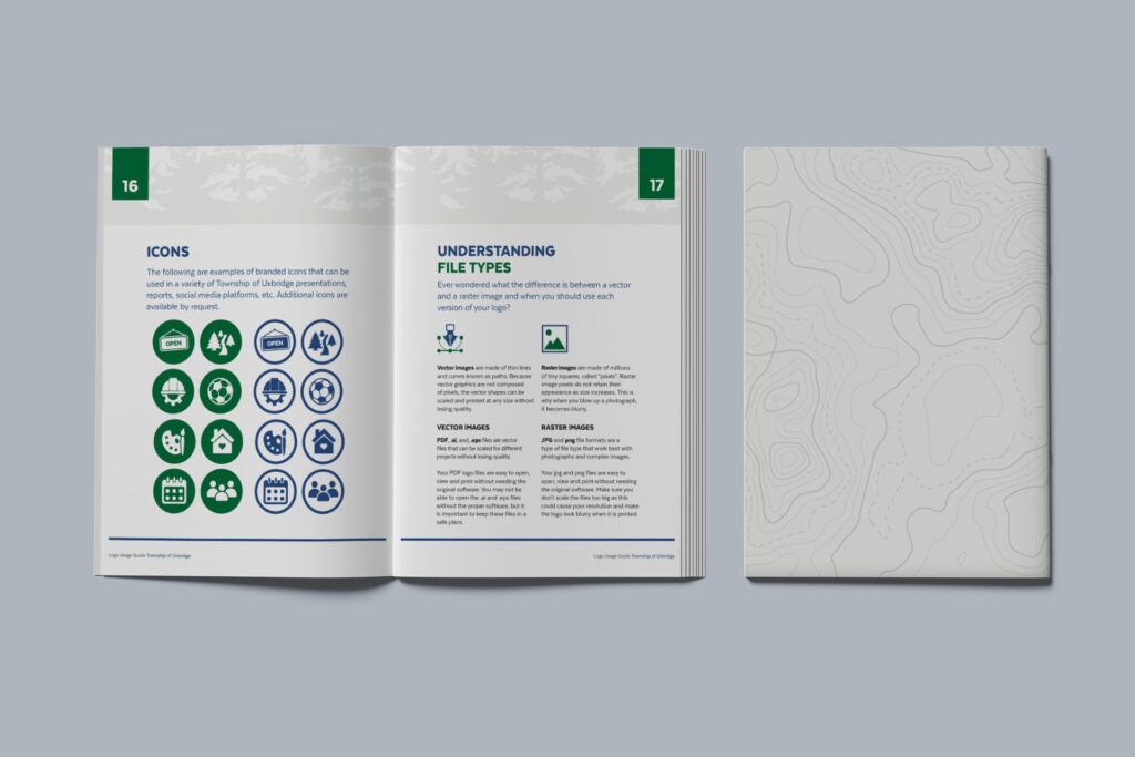
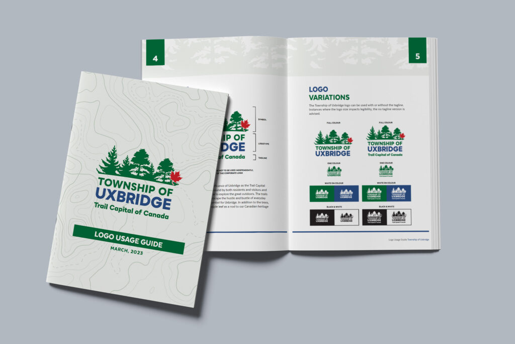
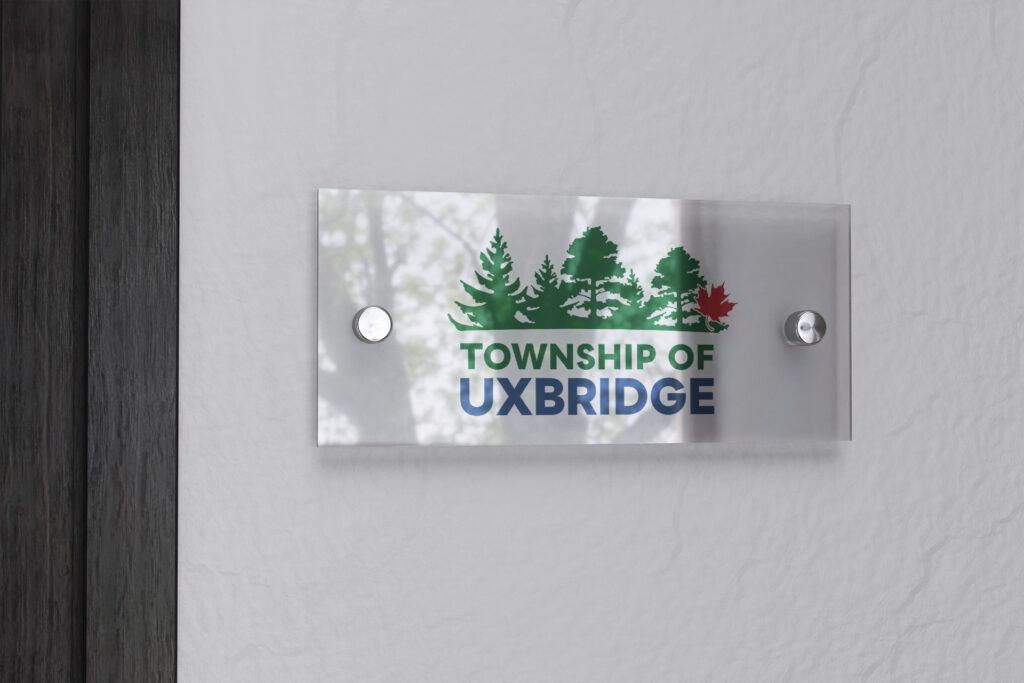
Continue readingTownship of Uxbridge Logo
Brock Township Library
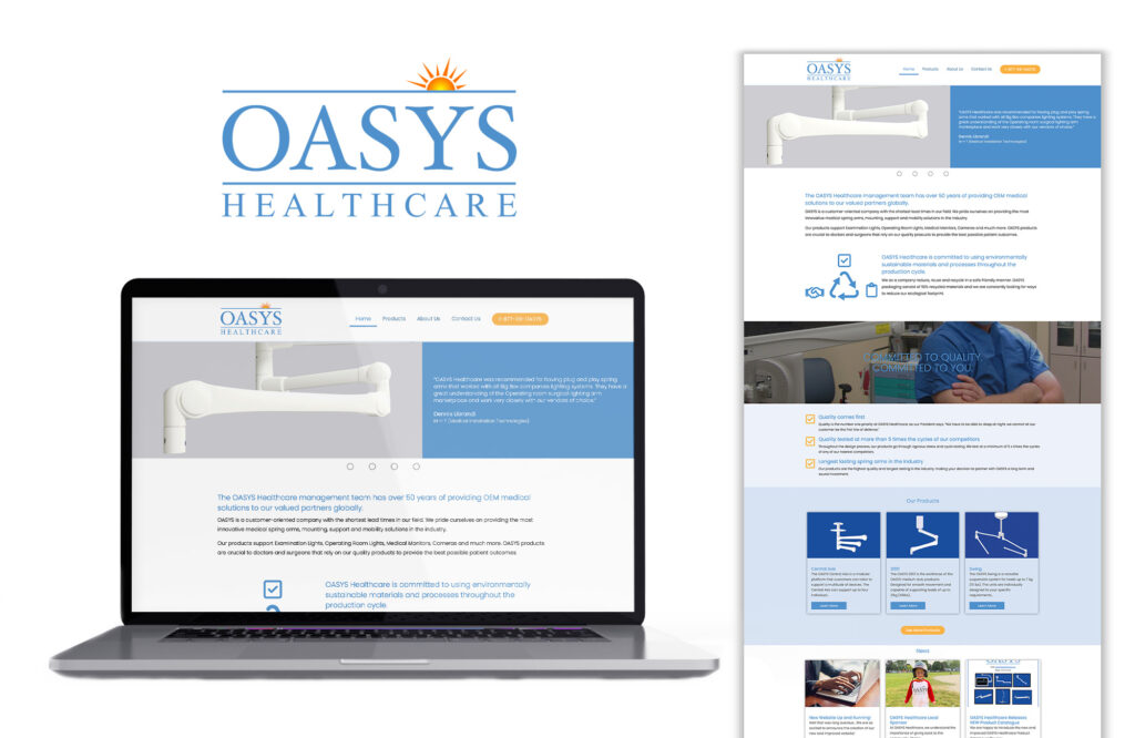
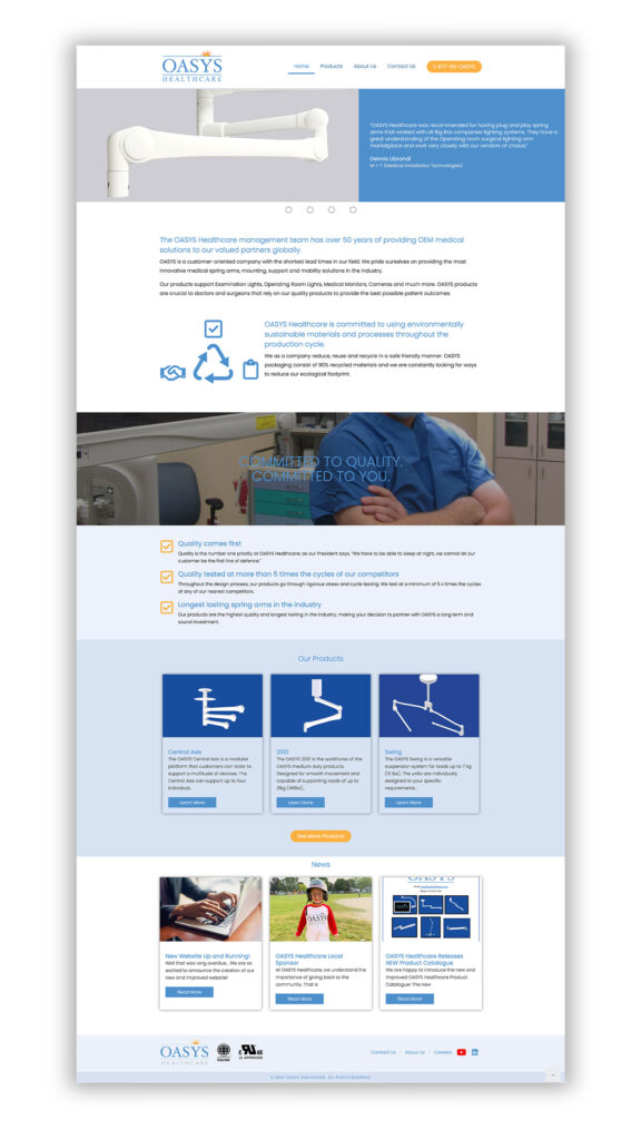
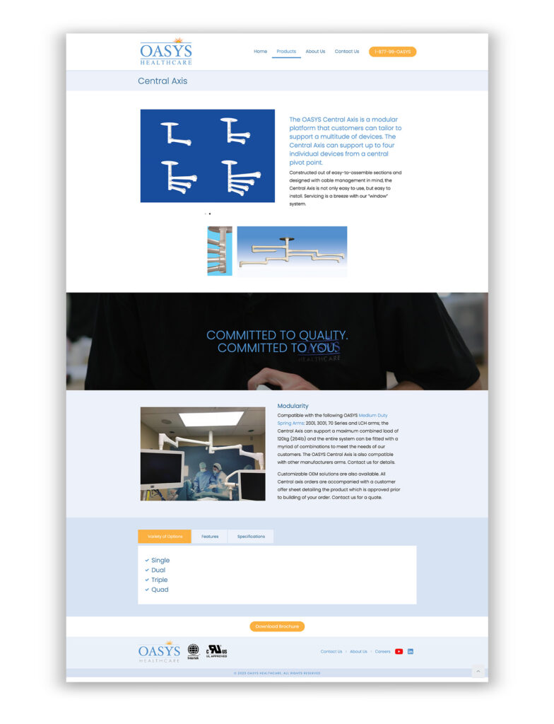
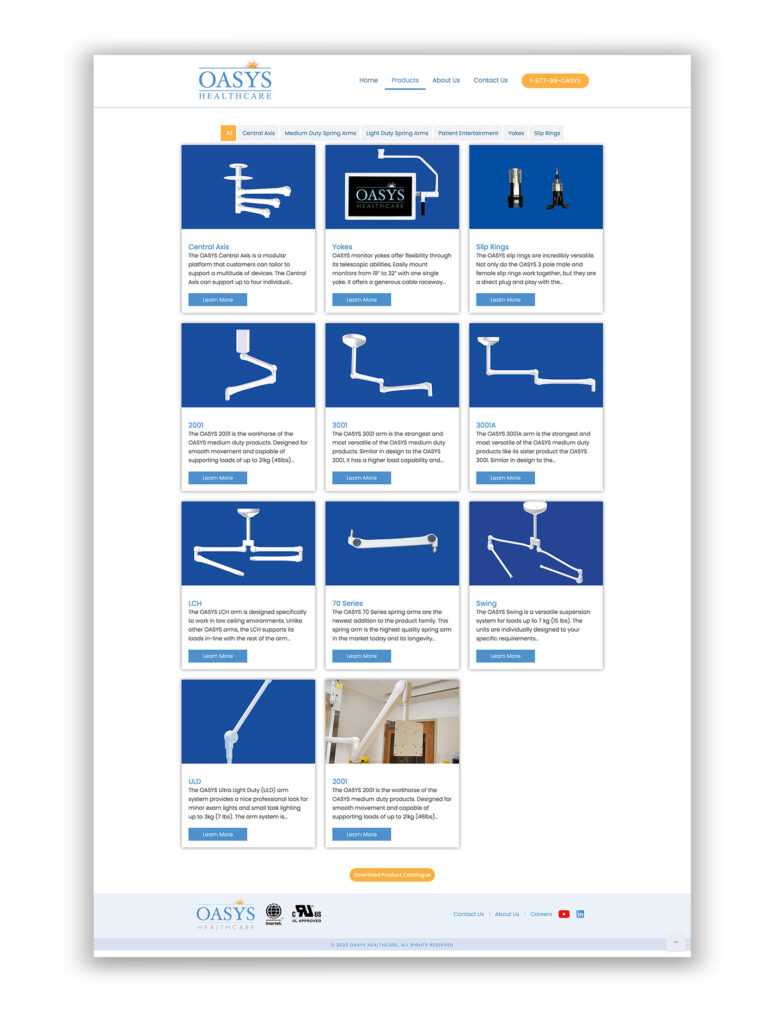
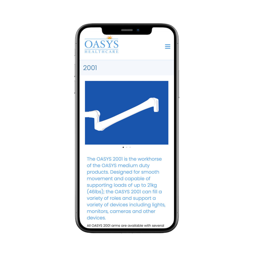
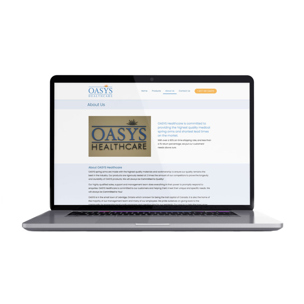
OASYS Healthcare

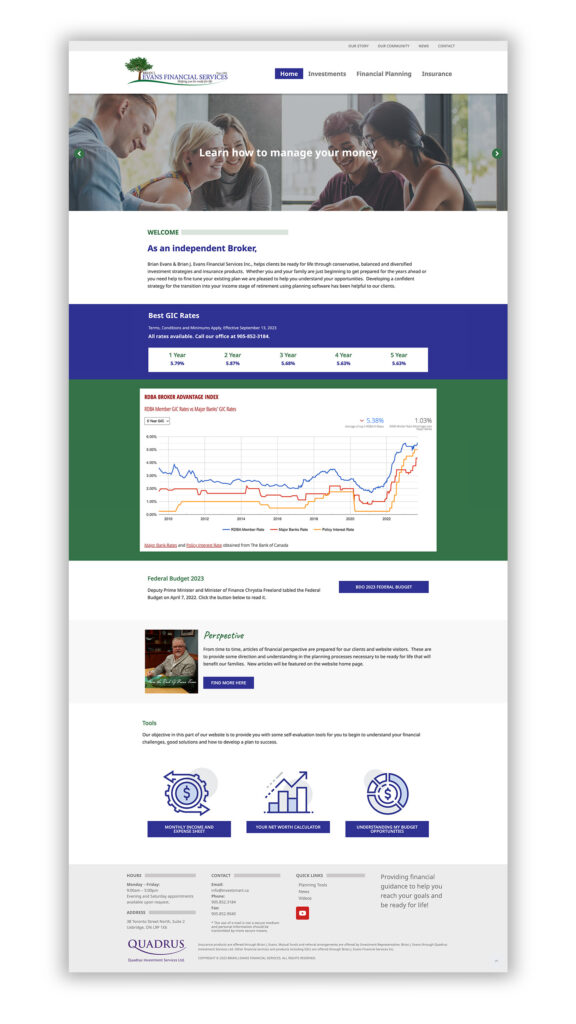
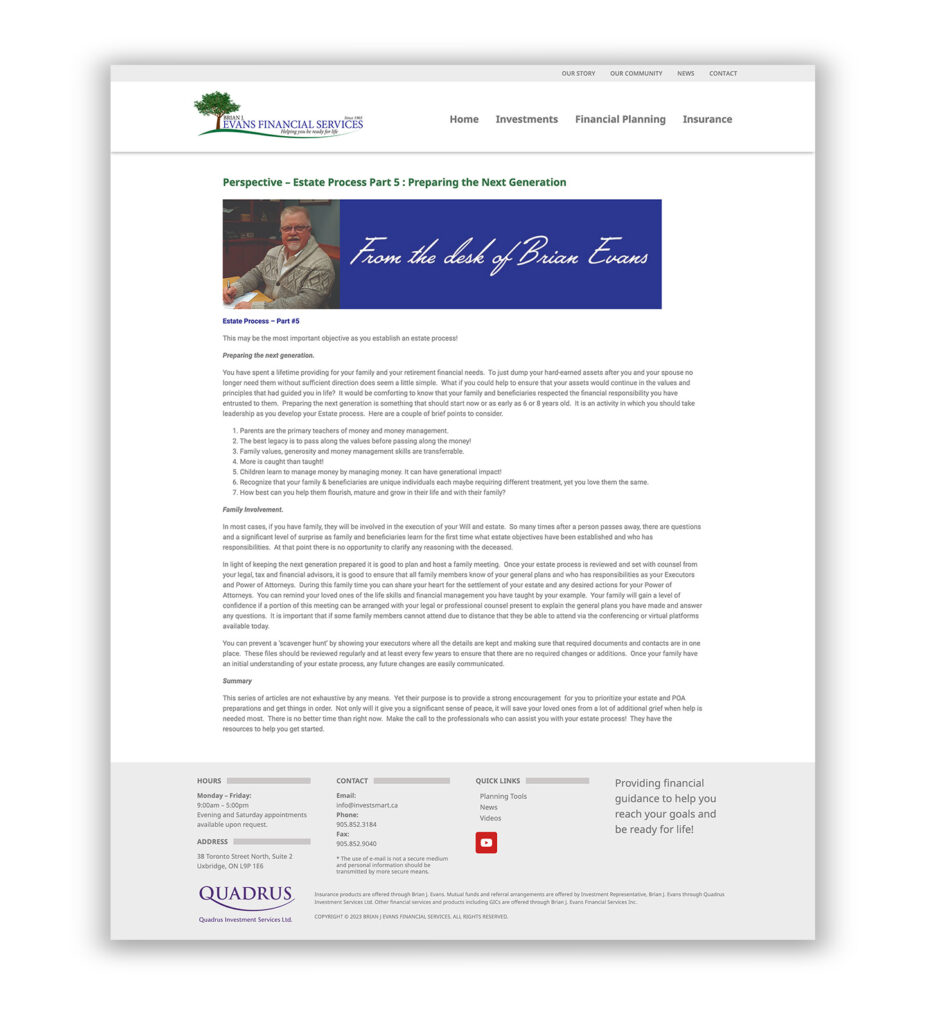
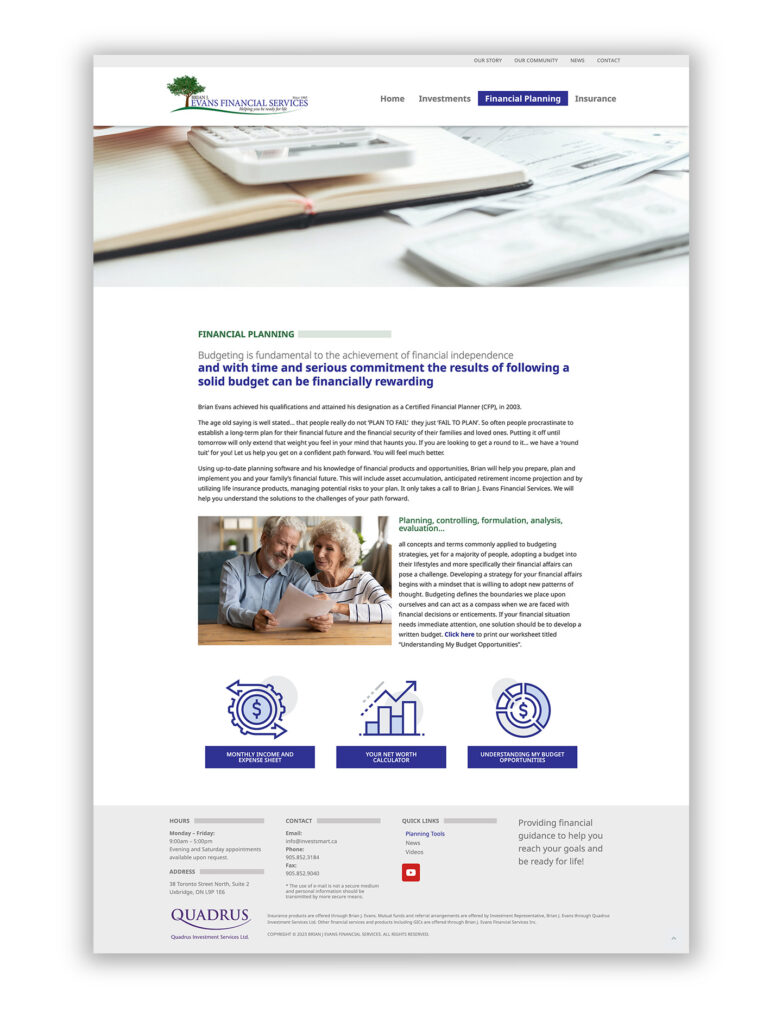
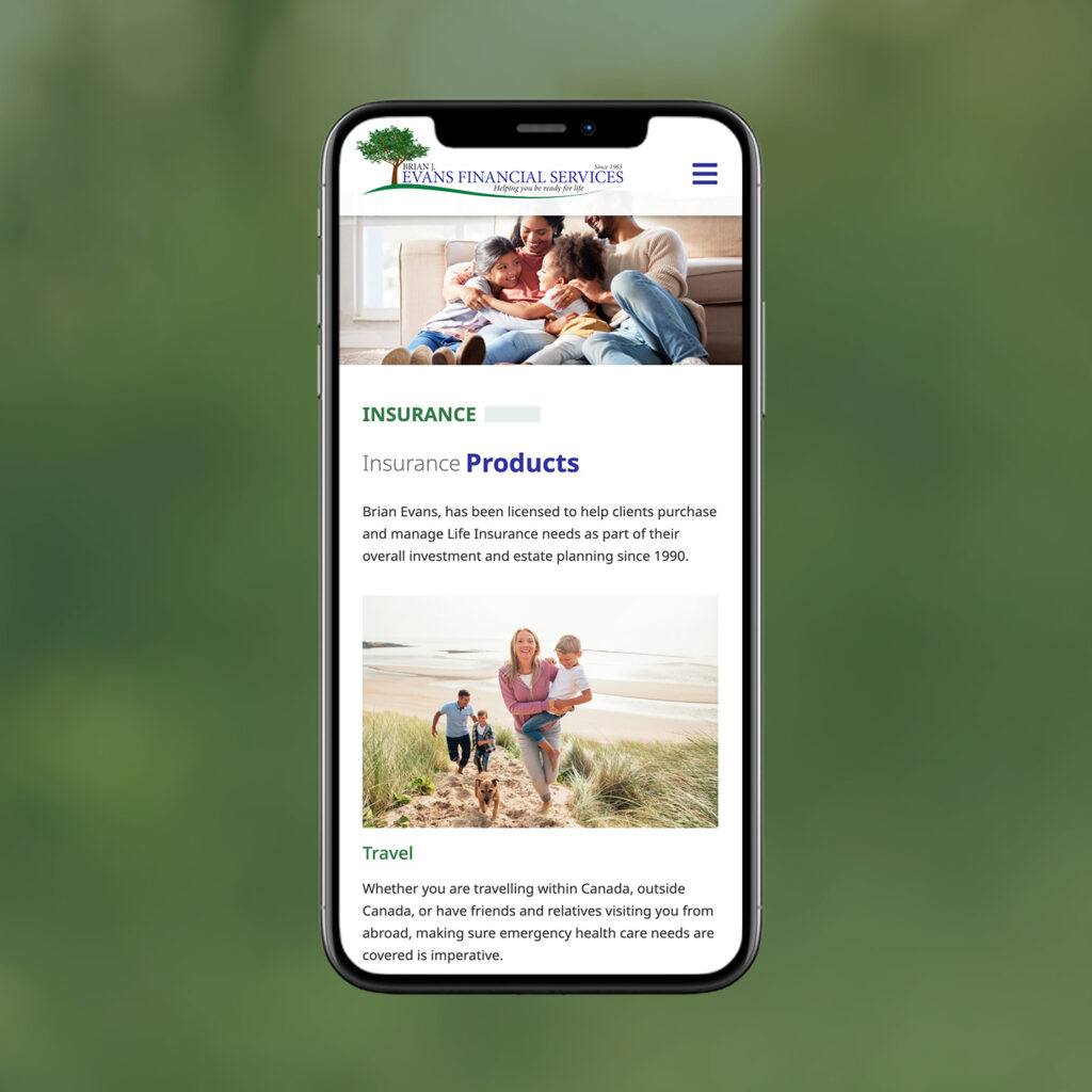
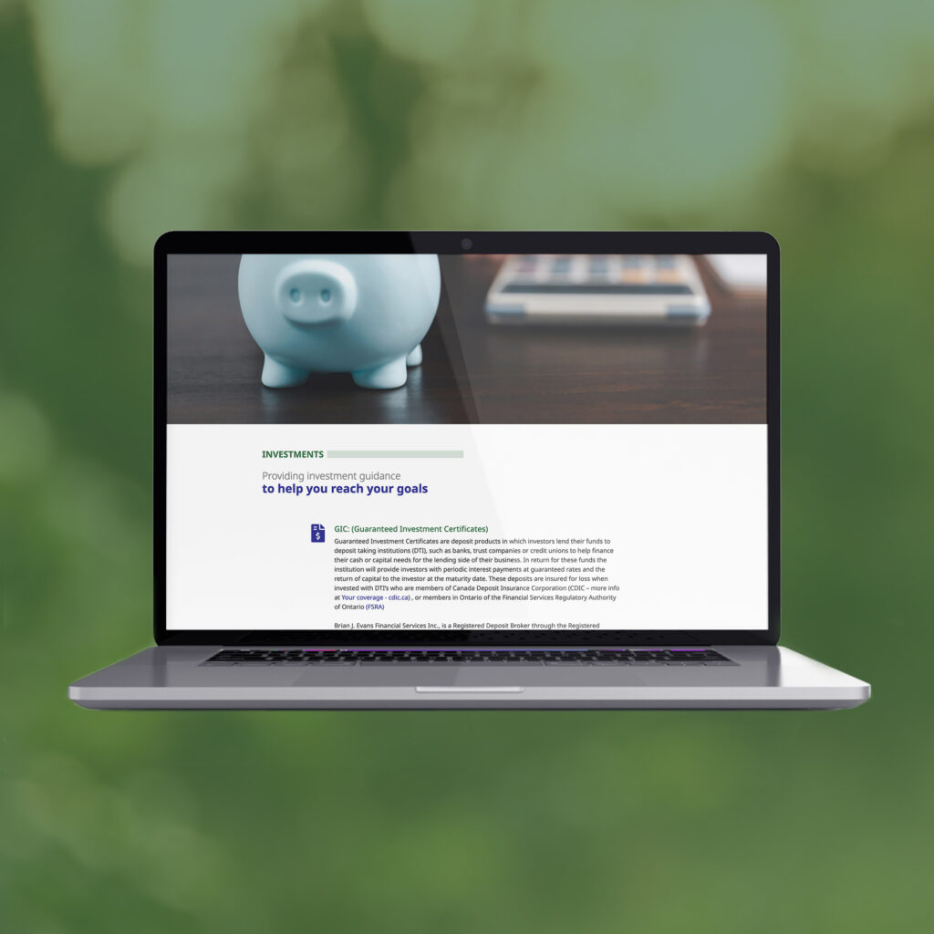
Investsmart: Brian J. Evans Financial Services Inc


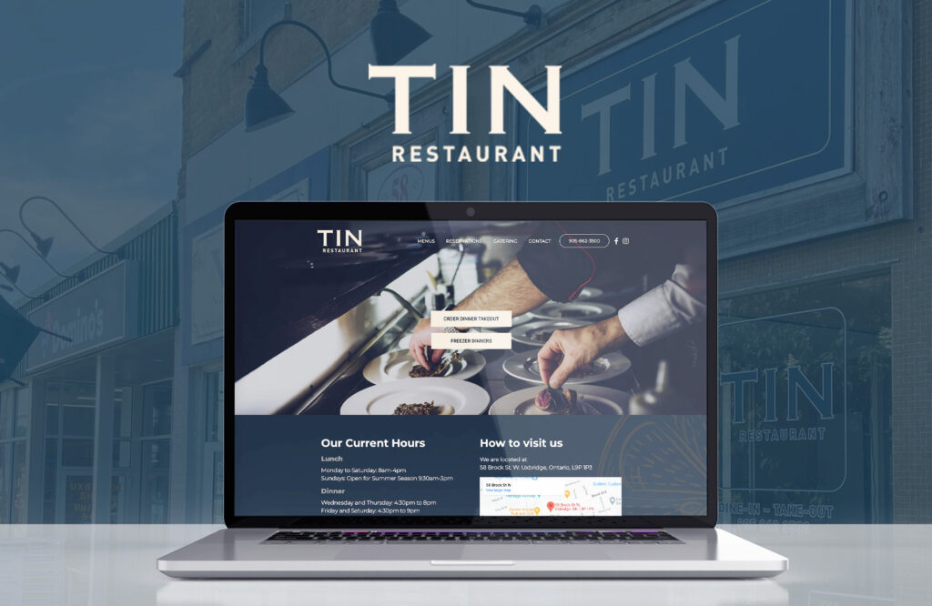
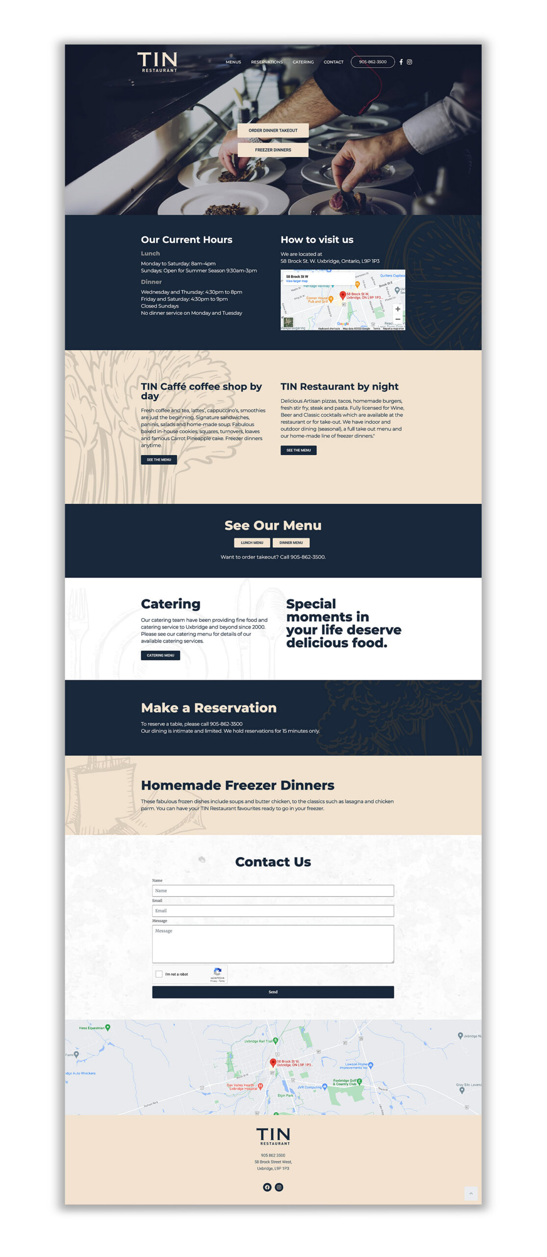
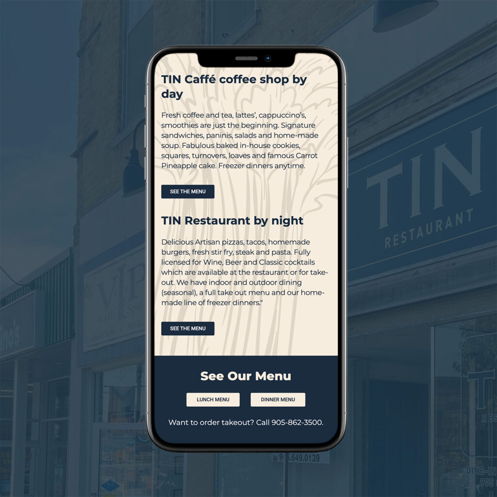
TIN Restaurant