Since 1999, Precious Minds has been supporting children, youth, and adults with developmental challenges in North Durham.
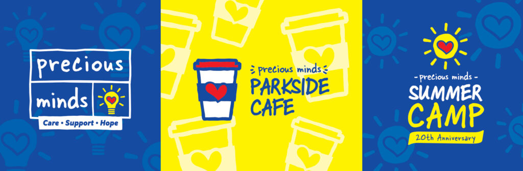
The logo that Precious Minds came to us with was one that was easily recognizable within our community and it was important to the Precious Minds team to maintain this brand awareness moving forward. The only issue with the existing logo is that they felt it no longer accurately represented the population they serve.
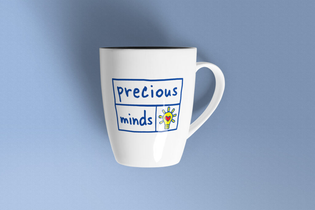
The goal of this logo refresh project was to keep the look of the Precious Minds logo that we had all come to know and love, but make a few slight adjustments to ensure it would appeal to both children and adults. To achieve this, we updated the font to one that is still playful and fun, but also has a more mature look to it. We applied this same idea to the lines within the logo, allowing them to keep an organic shape without it feeling too juvenile.
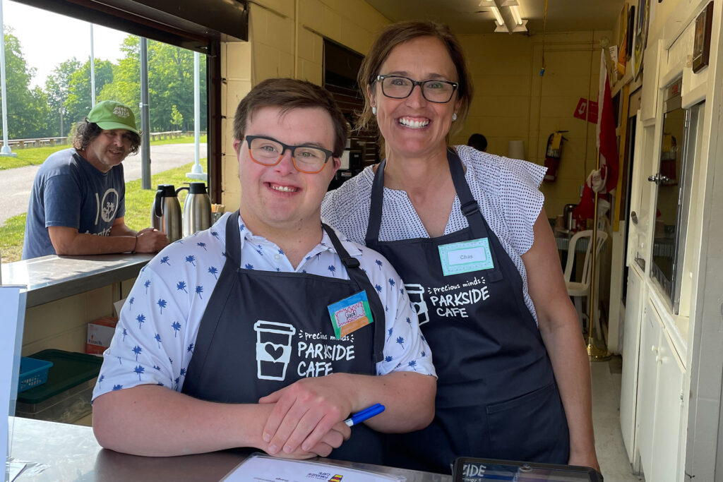
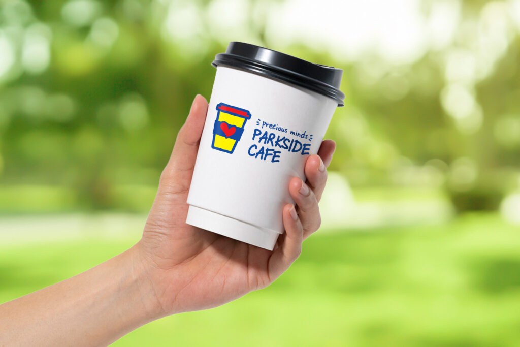
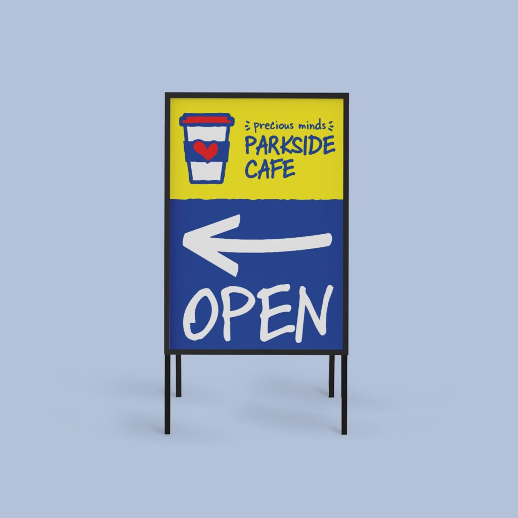
In addition to the main logo refresh, we were also asked to develop a new logo for their Summer Camp and Parkside Cafe. To tie all of the logos together, we used consistent colours and fonts, and included a simple but effective graphic (lightbulb, coffee cup and sun) with the Precious Minds’ heart inside for brand recognition.
Precious Minds was an absolute delight to work with and we are thrilled that we could provide them with a new design that closer reflects who they are. We are so pleased with the final look of this logo set and can’t wait to see these bright and cheery graphics around the community!