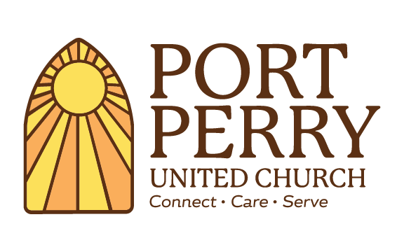
The Port Perry United Church has a long history in the town of Port Perry and a very prominent location of a large historical building in the downtown core. The main request in the brief was to use their large stained glass window as a graphic element in the new logo.
The final logo applied sun-like rays emanating from the centre of the window (a slightly different pattern than the actual window itself) to imbue additional meaning instead of the rather ambiguous glass pattern that actually exists.
We paired the window graphic with the font P22 Mackinac Pro which despite being a serif font also has a softer feel to it and therefore slightly more modern than other traditional fonts.
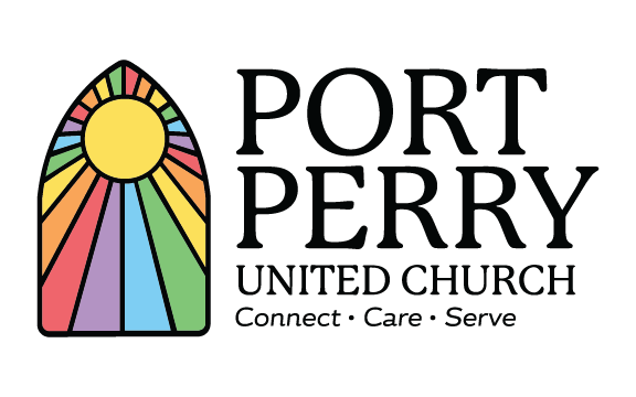
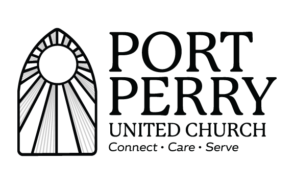
It was decided that a black outline (and font colour) would be too harsh in contrast to the vibrant lighter colours (the orange and yellow) and that brown was a better fit. The logo translated well into the two additionally requested versions: black and white and a rainbow version to be used in specific instances.