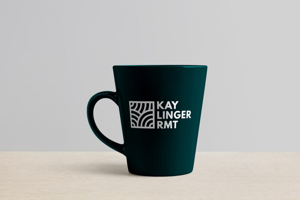
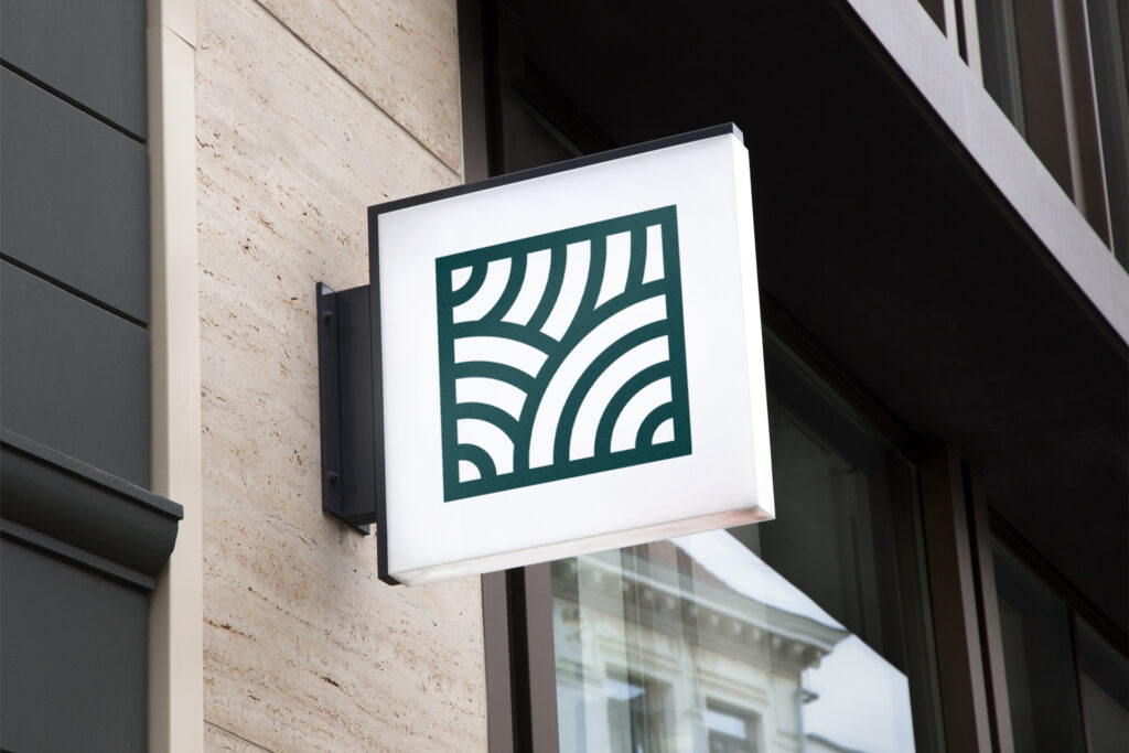
When Kay first came to us with this project, we were excited for the opportunity to promote his services and help him achieve his goal of establishing his practice and spread the word of his massage therapy business!
Together, we decided his brand should feel inspired by nature, convey the use of natural ingredients/methods, and invoke trust in clients of all ages. With geometric natural shapes, a soothing colour palette and a light-hearted yet credible voice, we feel like we did just that.
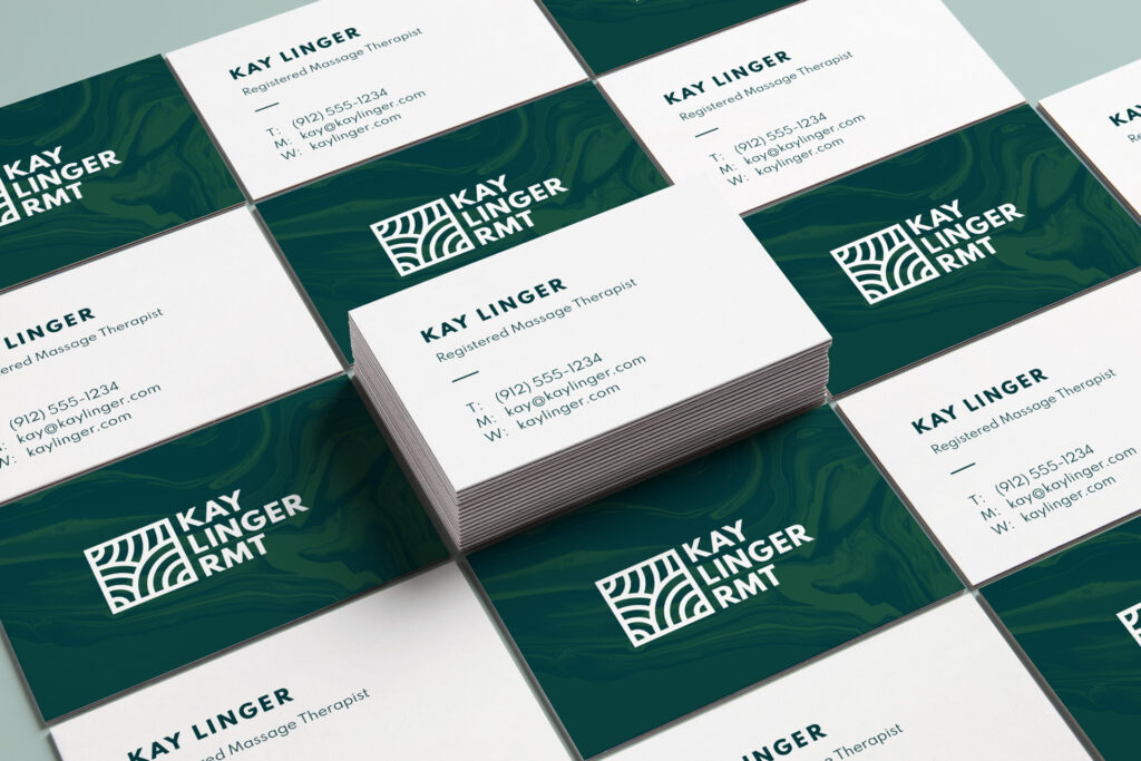
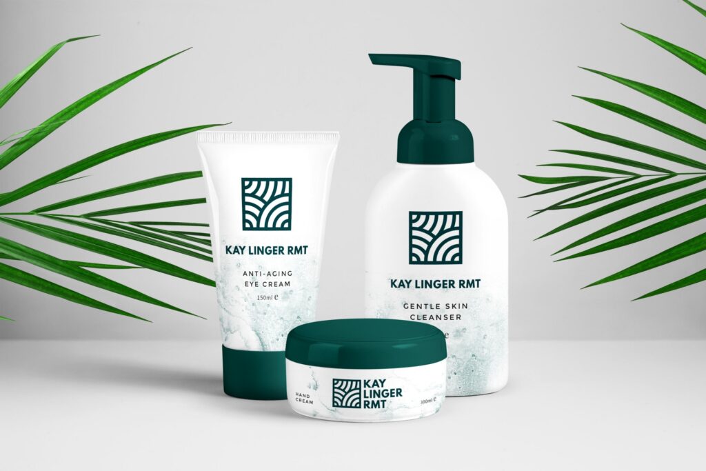
The mark itself is a close-cropped square framing a series of overlapping circles reminiscent of a zen garden, which really portrays the atmosphere and attitude of Kay and his practice. The use of texture and natural colours furthers this by leaning heavily on nature as inspiration, which Kay employs in his day-to-day methods.