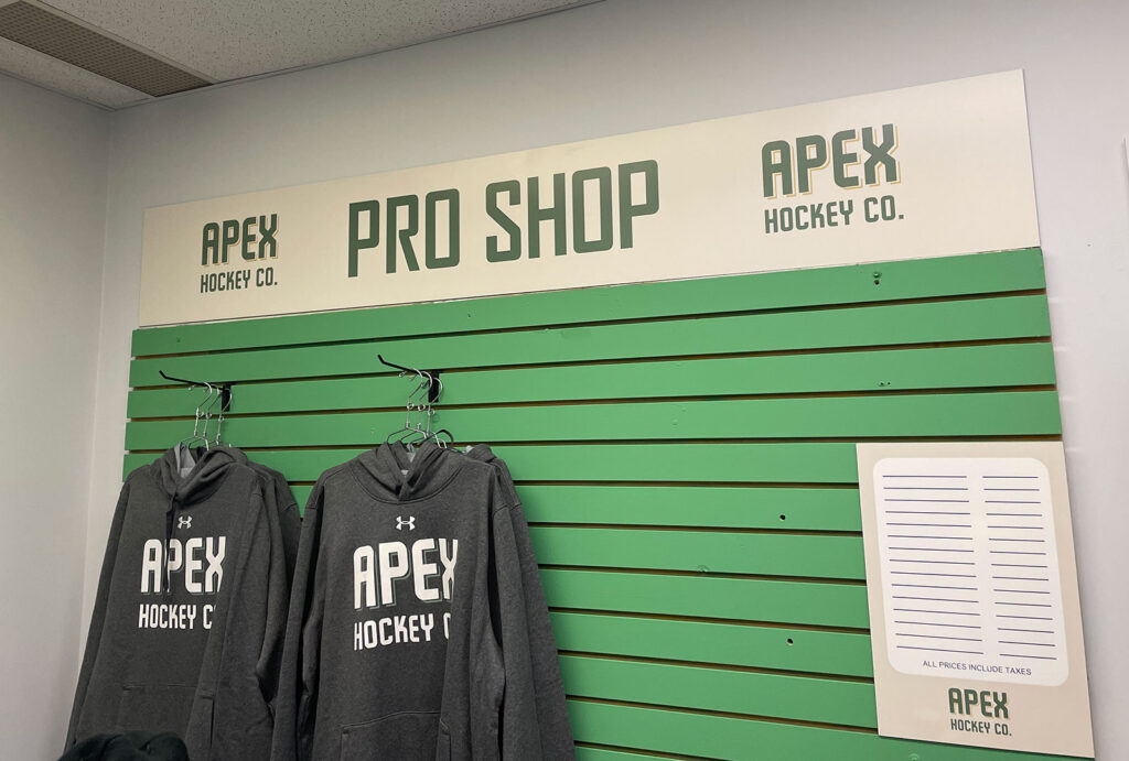
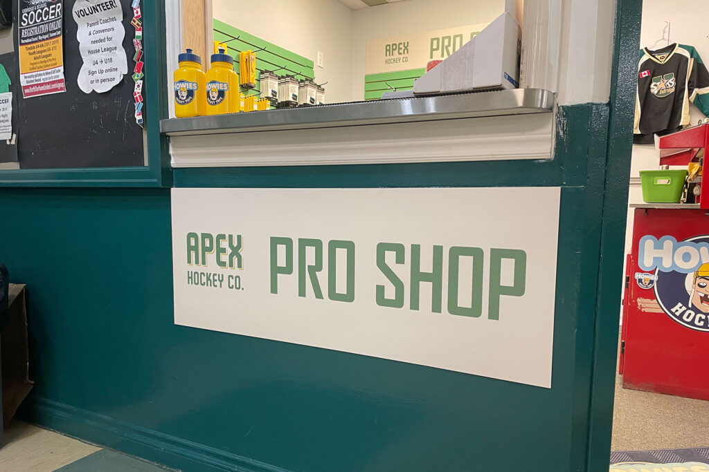
When the pro shop closed down at the Uxbridge Arena, Chris and Doug were among many hockey parents who missed the easy access to skate sharpening and other basics like tape and water bottles.
An opportunity arose to open a smaller shop in another portion of the arena so they quickly pulled together what was needed to make it happen during the height of the busy hockey season.
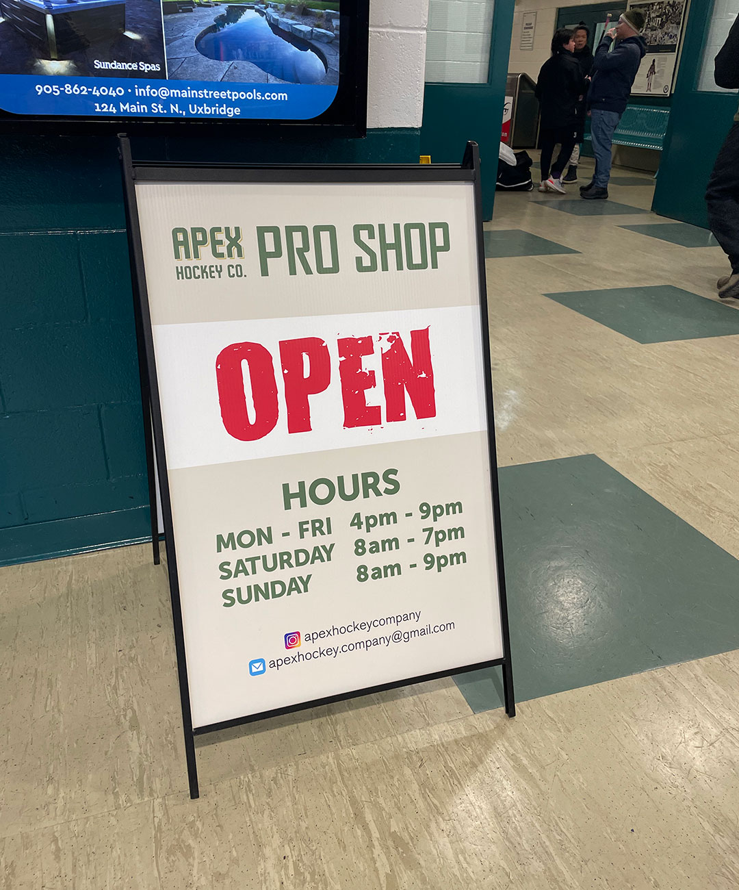
When they reached out to us to create a logo, they had very few requirements:
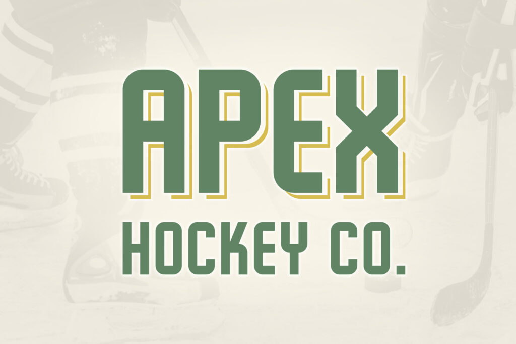
The name and logo needed to be generic enough to not lock them into only a pro shop as it may be used for other hockey-related ventures down the road.
They wanted to see a retro hockey vibe both in the font and colours of the wordmark.
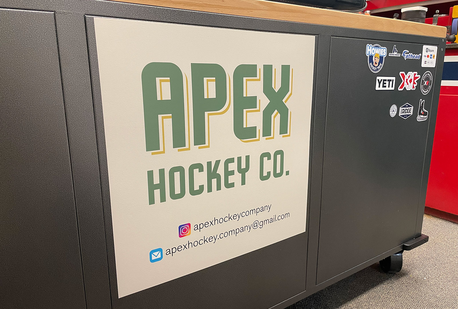
The timeline was a quick one since the store would be opening as fast as possible to begin offering skate sharpening right away. We put together a series of proofs – each design incorporating a unique retro font and with a colour scheme of cream, green and yellow. Originally the suggested colours were green and cream, but we’ve found that two-colour logos can prove to be limiting for other marketing projects down the road. We added a third colour (the yellow) to give the logo more depth and to provide a nice palette for future use.